top of page


F1 Wildcard Livery
Campaign | Standard Chartered x F1 Academy

Project Details
Roles : Creative Designer
2026
Speed, before the car even moves
When Standard Chartered partnered with F1 Academy to support Autumn Fisher as their Wild Card driver, they came to us with a first for the brand: their debut Formula 1 livery. Every creative asset in this project, the car livery and the race outfit alike, came from my own concept and execution.
The Aim
Standard Chartered's partnership with F1 Academy reflects something the brand has stood behind for years: championing the next generation of female talent in motorsport. This wasn't a sponsorship for visibility alone. It was a statement about opportunity, and the design needed to carry that weight.
The Brief
show the branding, make it feel fast on the race floor, keep it premium, keep it simple. Underneath that was a harder question. How do you take a brand built on trust and precision, and make it feel like speed?

Starting with the trustmark
My first instinct was to lean on SC's trustmark, using it to build a gradient pattern across the car body. It felt safe. Recognizable. Premium, even, in the way SC is usually premium.
But on the 3D car model, the pattern crowded the surface. Standard Chartered's brand lives in restraint, and a body covered in trustmark gradients worked against the simplicity that makes the brand feel premium in the first place.

Designing the outfit as one continuous system
The race outfit went through the most back and forth of the entire project. It couldn't just look good on its own. It needed to look right the moment the driver stepped out of the car, mid-motion, on camera.
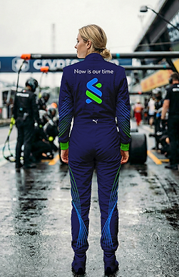
So instead of designing the outfit separately, I treated the line work as one continuous flow, starting on the car and carrying through onto the driver's body. Every line on the suit picks up where a line on the car ends. When Autumn moves from cockpit to podium, the design doesn't reset. It completes itself.
That was the hardest part to get right. Small shifts in where a line landed on the shoulder or sleeve changed whether the whole system read as connected or just coincidentally similar. We went through several rounds before the flow felt inevitable rather than designed.


Finding motion instead
I stepped back and asked what premium actually means in motion. In banking, premium means certainty. In F1, it means control. The strongest liveries don't shout. They make the car feel fast before it even moves.
That shift led me to line work inspired by the airflow patterns from F1 wind tunnel testing, tracing where the car would genuinely feel pressure as it moved. Not decoration. Structure. Every line on the final livery follows a path the wind would actually take, which is what gives it the sense of speed even sitting still in the garage.


The Result
The final livery balances exactly what the brief asked for: branding that's unmistakably Standard Chartered, and a visual language that reads as speed and motion the second you see it. The outfit extends that language onto Autumn Fisher herself, making the car and driver feel like a single design, not a vehicle and a uniform.
This was Standard Chartered's first F1 livery, and the goal was never just to look good on track. It was to visually represent what the partnership stands for: a new generation of talent, given the platform to move forward.

Curious to learn More?
bottom of page